before
after
Reviewed Aug. 30, 2017 by Armin
Industry / Entertainment
YouTube. End of introduction.
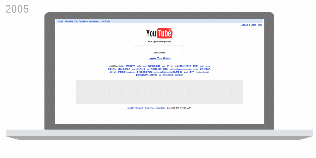
But, sure, to expand a little on why we are here today: Yesterday, YouTube introduced a significant update across its multi-platform presence, from mobile to desktop to game consoles and more, evolving the user interface and overall experience. (Why they keep making the ability to customize the size of the embed harder with every iteration, now literally impossible, is so infuriating it could cloud my judgment about the logo redesign but I’m a better person than that, I think. Also, I digress.) Along with the overhaul is a new logo design that for the first time in 12 years drops the TV shape that encapsulated “Tube” for so long. This new evolution was designed in-house.
The bright red cherry on top of this update sundae is a refreshed YouTube Logo and YouTube Icon. Designed for our multi-screen world, the updated Logo combines a cleaned up version of the YouTube wordmark and Icon, creating a more flexible design that works better across a variety of devices, even on the tiniest screens. Why’s it more flexible? When room is limited (say on a smartphone) you can use the brightened up Icon as an abbreviated Logo, which will be seen more easily and read more clearly.
YouTube blog post
They decided to ditch the original typeface [Alternate Gothic Number Two] and design one of their own. They experimented with fonts based on styles from classic television and the VHS era as well as more modern looks. In the end, they went with something that retained the essence of print. “We wanted to keep the history, and the tension of a media typeface that was made in 1903 to be typeset manually with a digital platform that reaches farther than any newspaper of the time could ever conceive of.” For the play button’s updated color, the team tried to find a grounding in the medium. “Looking at reds, we wanted to go for something that would tie to video,” Bettig explained. They settled on #FF0000, “a really pure red that goes to the RGB of video.”
The Verge article
I have never liked the TV shape in the YouTube logo and how it awkwardly separated the two words. It has come a long way from its original execution with the cheap bevels/shadows/gradients but, to me, it always felt like a very dot-com-ish logo. Over the years, the red play button has increasingly become the de facto identifier for YouTube and it is now taking its rightful place as the official icon to YouTube… the Swoosh to its Nike, if you will. With such a dominant graphic device, it would almost have been a brand crime to not take advantage of its ubiquity and recognizability.
In order to allow the play button to take the lead, dropping the TV shape from the name makes perfect sense, especially since both were the exact same shape and there was no room for both, just like there is not enough room on the Iron Throne for both Cersei and Daenerys. Removing the TV shape finally allows YouTube to read as “YouTube” instead of “You (Tube)” so CamelCase lovers rejoice! Once removed, it’s also quite surprising how recognizable the condensed wordmark is as YouTube. The combination of letters is so particular that the TV shape isn’t really needed to make the quick read.

Technically, this is an absolutely fantastic update. They have taken the blunt shapes of the old letters and improved on all of them to create a beautiful wordmark. At small sizes the change is almost imperceptible but at larger sizes the change is a feast. If the way the stems meet the curves on the bottom of each letter doesn’t give you heart palpitations then you might be in the wrong industry. That is really masterful. Dork-swooning aside, every letter is better — better designed and better suited for every size and screen possible. Play a little game of Spot the Difference and you’ll appreciate what I mean. The wider opening of the “Y”, the rounder sides of the “o” and “e”, the contrast in thicks and thins. So good. Also, the kerning couldn’t be better.
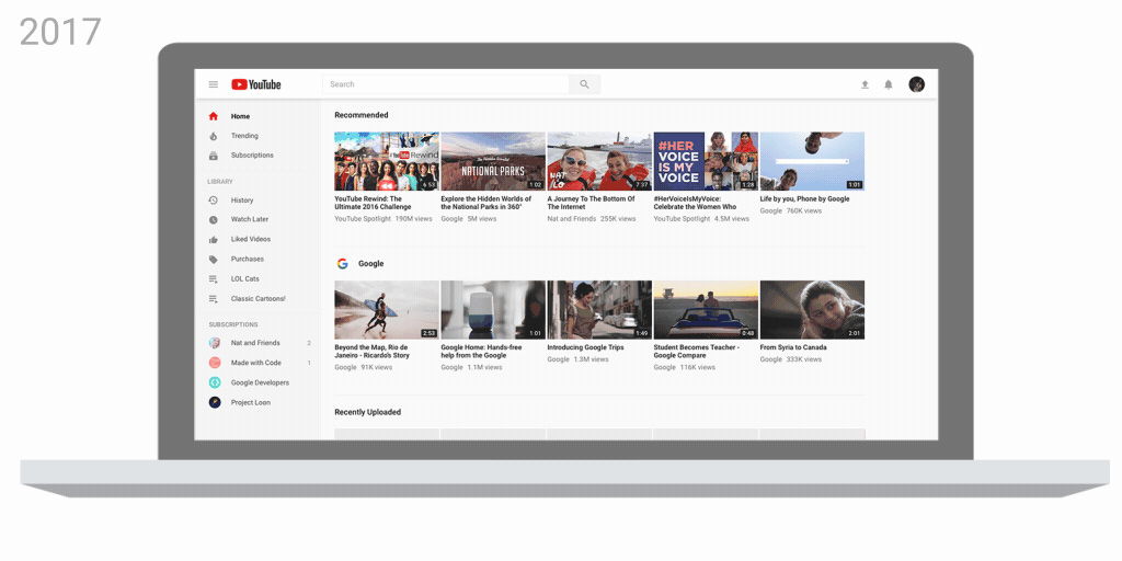
I won’t get into the UI too much but at a quick glance, it looks sharp… maybe a little too busy in some areas but it all holds up neatly together. The video above uses the new YouTube Sans type family which I thought was to be used on the UI of YouTube TV (but which I also assumed would spread to all of YouTube). In contrast to the crispness of the new logo, the type looks kind of clunky and like a very weird complement to it. Maybe in time they’ll figure out what the best relationship between these two is. Overall, this is a perfect evolution that makes sense in terms of the evolution of the platform itself as an all-encompassing, fully-consuming medium where a lot of people spend a lot of time (myself included) while fully establishing the play button — by removing the competing TV shape from the logo — as one of the most important graphic icons of our era.

Comments